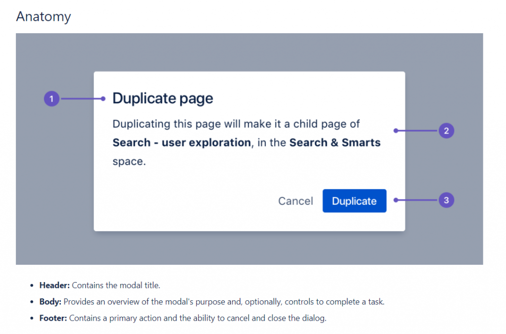
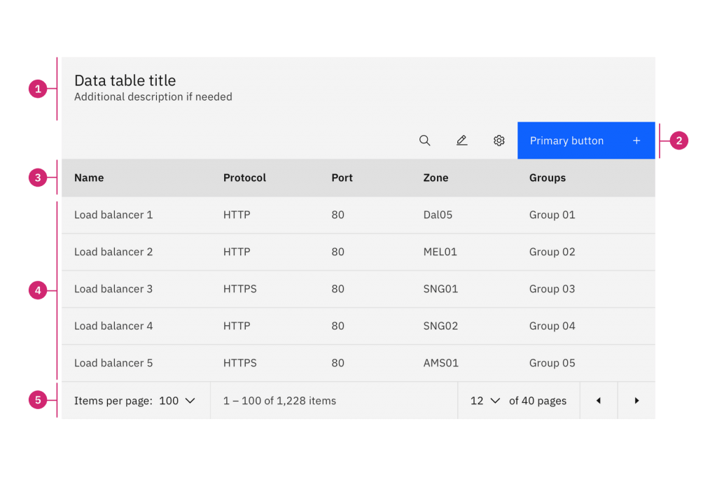
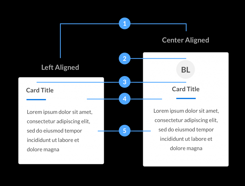
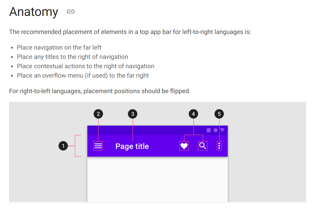
Naming things is hard, and having everyone agree on a shared language is even harder. Discussions can be very messy when the thing everyone calls a spinner is named a loader in the design system, or when nobody is really clear on what the body of a product card really is. Today I’ll show you one way to deal with this, and more, using what I dubbed component anatomies.
When I notice a pattern in a design system I had not paid attention to before, I most often understand how it came to be, what purpose it serves, and how to implement it. The first time I noticed a component anatomy, though, I was a bit confused. It looked nice of course, but that seemed like quite a bit of work for limited value, surely everyone could tell a label was a label and a thumbnail was a thumbnail. Then it came up in another design system and another. I realized I must have missed something, if so many teams found value in doing it there must be a reason. At the same time in my new job we started working on a new component: fairly complex and with many elements, we had trouble finding common names for its various elements, making all discussions difficult, requiring gestures and “that top thingy” kind of naming. That’s when it hit me!
Component anatomy is not just about what you display in the documentation, it’s about how you come up with those names, how you built upon that to write better docs and components, and how you encourage common nomenclature to discuss everything about your components.
Ubiquitous language
It’s ironic that most design systems aim at encouraging uniformity and coherence, yet as we make them we’ll have trouble agreeing on the same name for the same things. But it’s not that easy, some things just have many names, from modals, dialogs, and popins, to tooltips and popovers.
At first, you might notice a few inconsistencies, some teams having their own name for a thing, design and development teams having a different preferred word for another. Many teams face this issue and it’s possible to live with it, but it’s just so much simpler when we can all agree on a shared language. The devil is in the details too: your header is probably the top of your page, but does that include the breadcrumb or not? If you have a list of articles with an image a title and the excerpt, what is it that you call the content? Is it the whole thing or just the text? It’s not that big of a deal but it’s very easy to waste time and get frustrated when we realize we don’t even agree on basic terms.

For this reason alone, having a component anatomy is a very good idea: it takes a little bit of work initially but it makes things so much easier in the long run!
Interactive component kick offs
The best time to start working on your component anatomy is, surprisingly, as early as possible. As soon as you have a first design draft, it’s a very good idea to gather a bunch of people and involve them all in naming things together.
I’ve organized a few of these meetings, they’re really short and effective: show a draft of the component, ask people to start by numbering all the elements that they think would need a name. Review that list, you might see some people go into a lot of details, other focus on general areas. Agree on what you want to name and what you don’t (for a form input it could make sense to name the icon that can appear in it, but do you really need to name the border? Well actually maybe you do if you want one of those dynamic-looking borders that animate on hover…). The second step is to have everyone go through the list of elements and propose a name. It might look easy but you might realize that two names could be ambiguous, that one term is too generic. When everyone is done review all the names and choose the final ones. If you involve just 3 people, this can take less than 10 minutes and is a good opportunity for everyone to dig deeper into the component, into what it does and how it works, to better prepare for the next rounds the component will go through before being actually used live in a project.

Align specs and behaviours
When you have your component anatomy laid in front of you, it’s a lot easier to write very precise specs. For something as simple as a dropdown button, it becomes very easy to see which area will toggle the dropdown, is it only the caret icon, the button label, or is it the whole button?
Similarly, it helps give detailed content strategy guidelines for the various elements. How do they truncate? What kind of case should be used and so on. It’s very easy to have a basic table listing all elements, their names, and the important functional and content rules that apply to them. This makes synchronization between the design and development teams much easier than long-form design specs that sometimes get overlooked during implementation.

Helpful tools to get you started
Ready to make the jump but you’re not sure where to start? I didn’t use them and made my anatomies with Figma, but you might want to look into the NPM package for component-anatomy by Donnie D’Amato to have smart in-page edition and saving functionality.
Speccer on GitHub by @phun_ky is another interesting project, aiming to do a lot of automatic annotations on live components, including numbering or naming them for component anatomies.
If you have a big component currently being designed, maybe it would be a good idea to try this out. Gather a few colleagues, have them help you name its elements, and see how much this helps communication later on and how much shorter your specs become!
This alone won’t fix all communication issues you could have and if you have other tools or techniques that you like to use please let me know!
