Words are everywhere and a Content Strategy is a plan to make sure that the copy all teams write for their products fits the company’s principles and values. Surprisingly, despite its importance, copywriting is often forgotten when it comes to designing and documenting components.
I browsed hundreds of design systems, seeing so many missed opportunities but also great ideas and incredible examples, so I rounded up the best ones to give you ideas on how you can nudge teams, promote good copywriting, and overall put the right words in front of your audiences! Let’s dive in!
Hudl’s Uniform
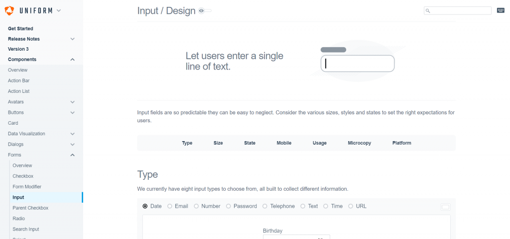
If there was one greatest example to look at it would be Uniform! The design system includes comprehensive Writing Guidelines that go into great details about how to write on brand and convey the company’s principles, but they don’t stop there! For every component in their pattern library they use real-world copy in their examples as in their Form Input examples along with copywriting guidelines and examples as in their Action Bar component’s page.
If you were to join Hudl and needed to re-use a component in design or in code, every possible opportunity to show you what good copy would look like is covered: the examples, the relevant guidelines with specific examples, and the whole writing guidelines. If you want to find out how to implement an incredible Content Strategy in your design system, this is what you should aspire to do!
Uber’s Brand Guidelines
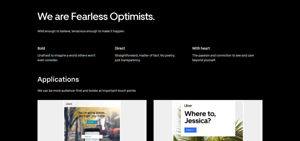
This example is a “Voice and Tone” kind of page giving general rules about how one should write for Uber. It stands out by using a lot of screenshots and examples to turn general guidelines and principles into actual screens and sentences.
Along with the examples are very practical tips that are almost like a quality checklist to hunt bad copy with advice like “Cut the adverbs” or “Look for ‘that'”. While many pages of this kind can feel like a drag to go through this actually looks like something you’d bookmark and go through every time a new sentence gets written to quickly ensure it’s high quality and on-brand, and that’s exactly what you should aim for when writing a content style guide!
Inuit Content Design
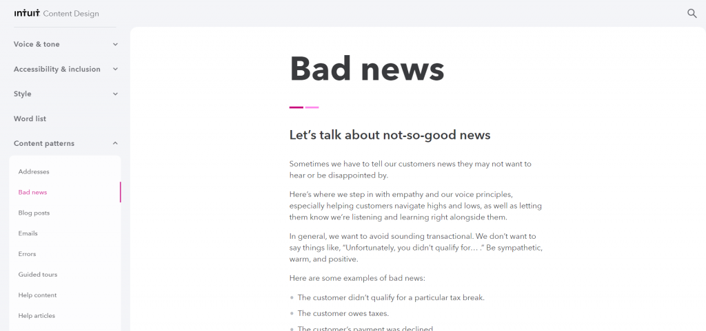
Inuit’s Content Design has pretty much everything you could look for in a writing styleguide but one thing that very few others have is actual Content Patterns. They help everyone involved write the microcopy from call to actions to error messages.
The Error content pattern for example is pretty much a recipe: explain what happened, explain what went wrong, give the next step, put this all together and that’s it. Of course along with multiple examples to figure out how best to put it. This kind of guideline is pretty rare yet is incredibly powerful in fine-tuning your voice at scale, for every detail of your digital products!
Frontify’s Brand Guidelines
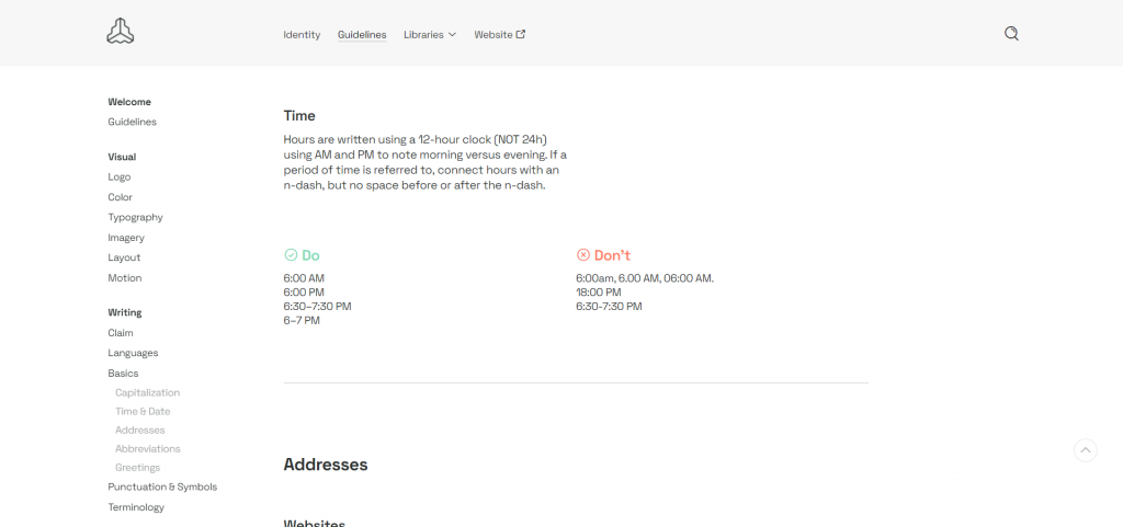
As the third arch of an exhaustive Content Strategy, Brand Guidelines includes everything you need to know about writing and formatting content: capitalization, typography, abbreviations, and so on. They also include an incredible Terminology page that lists all the features, products, tools and every other term that exist in their ecosystem so that it’s always referred to the same way whenever it’s mentioned.
Beeline’s Design System
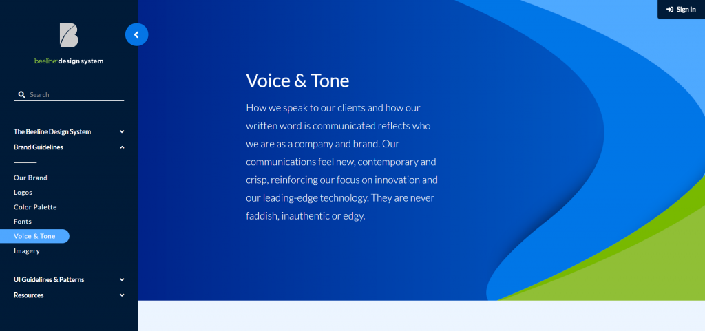
Here’s another goal to aim for: Beeline’s “Voice and Tone” page contains precise and concise guidance and lots and lots of real-world examples, along with guidelines for imagery as well. Along with that examples from real-world use cases for the components in their Pattern Library, such as the Button component.
Mailchimp Content Style Guide
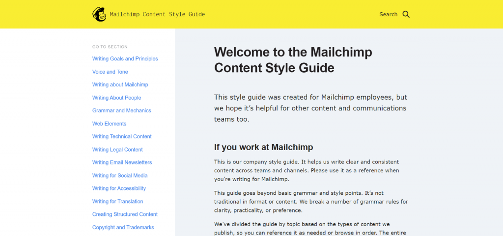
Mailchimp is one of those brands in the B2B space that manages to be professional while having a lot of personality. It’s not magic it’s a well-thought-out Content Strategy that’s properly executed but you can see how far they’ve thought this through in these guidelines. They don’t just ask whoever writes for them to be funny except when they shouldn’t, they have general guidelines along with specific guidelines for Technical Content, Social Media, Accessibility, or Emails… Every context is treated with its own constraints and aspects to ensure impeccable copywriting.
This is an incredible example of what to do if you want to play the difficult game of being friendly and fun while dealing with serious things sometimes!
18F Content Guide
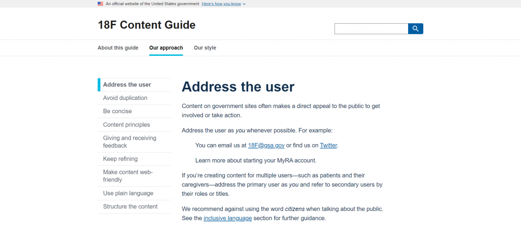
This one is built like a handy checklist that you can browse through every time you write something new. It’s the essence of guide: a list of simple principles to apply over and over but it’s done so in a very casual way, despite being targeted at government agencies with examples and is easy to follow.
If nobody in your team is really versed in copywriting, this is really something to steal and adjust to your own needs when you need to diverge from it but a lot really is suited to most websites and applications really!
Tuts+ Style Guide
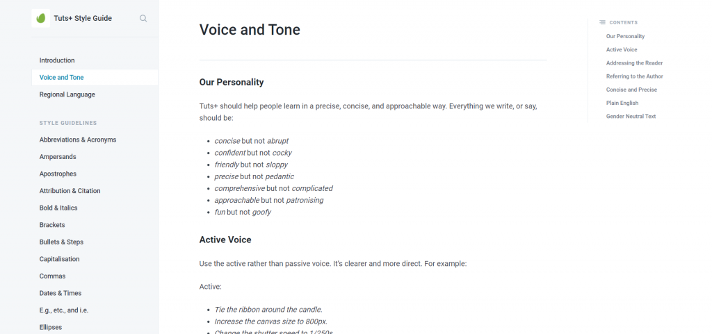
Here’s an example from the Tuts+ blog and as you’d expect from a company making money from writing content they’ve thought about it quite a lot! Almost everything is covered including obscure things like whether the plural of JPEG should be JPEGs or JPEG’s… This showcase isn’t about how to create good navigation in design systems but the use of very large “Next” buttons at the end of each page encourages the reader to keep reading while keeping the pages fairly short and dedicated to a single point of attention.
Shopify’s Polaris
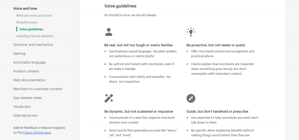
Polaris is built by Shopify but its audience is much larger than just its own teams: the guidelines and tools are also geared towards independent shops and developers making their own plugins for the platform. To ensure they produce great content Shopify’s guidelines are simple yet precise and help anyone understand how to craft good customer experiences, including writing good copy.
Atlassian’s Design System
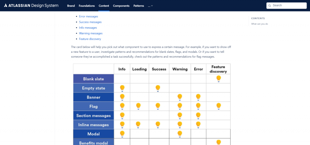
What kind of Design System showcase would be complete without a mention of Atlassian’s? When it comes to content and copywriting, once again it shines, especially with this unique table that helps you figure out which kind of content pattern you’re most likely to use with which component.
Overall the Content Strategy is written in detail and very easy to scan or read in-depth. I was a bit surprised to notice that the components don’t use real-world content though… I guess everyone including the big players out there still has room for improvement!
A List Apart’s Styleguide
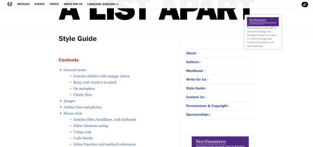
Whenever you produce content you’re never writing “for everyone” and having your audience in mind is required to craft the best copy for them specifically. A List Aparts is great at that, their writing styleguide starts off by remembering everyone expected to write for them who their targeted audience is and how that affects how they should write.
It goes into details regarding how to format code blocks and inline code for example or how to reference technicalities in paragraphs which is definitely something of interest when writing documentation as well!
Infor’s Design System
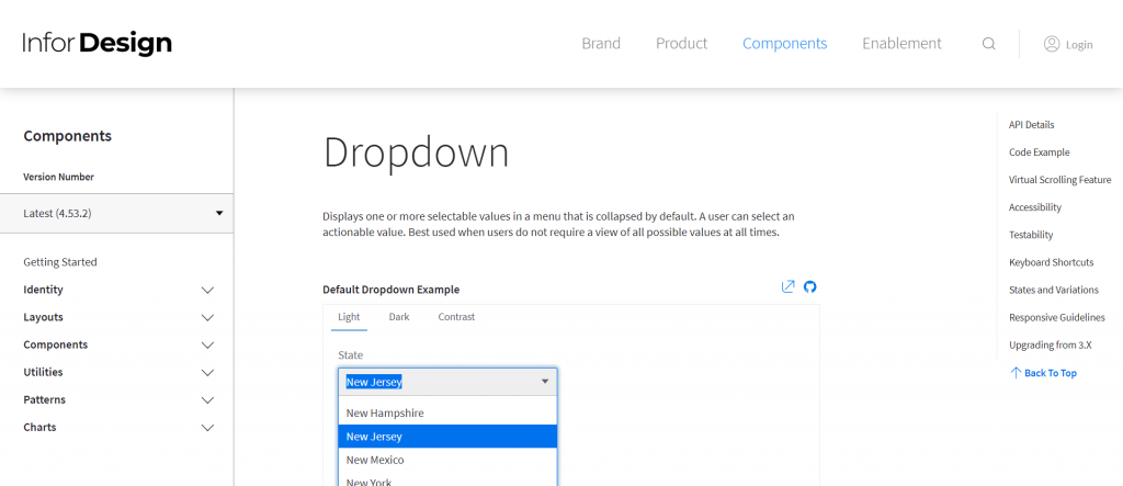
To finish off this list I picked a good example of using real-world content to display examples of your components. It doesn’t look like much but it helps to figure out what’s what, how things work and nudges designers and developers towards consistent use of the tools handed to them.
The Hierarchy Chart is another good example of this: you don’t need to define that something needs to be a name and something else needs to be a role when you can simply write names and roles while conveying how they should be cased and what it looks like with real data and possibly edge cases!
That’s it for now, if you have more good examples to share with me please put a link in the comments! I hope all these good examples have helped you figure out opportunities to improve your design system along with good examples to steal from! I’ll be publishing another article shortly to guide you on that matter so stay tuned for more!
2 thoughts on “Content Strategy showcase : 12 Design Systems that get it right”
Comments are closed.