Carbon is a very impressive design system, with slick components and comprehensive guidelines for writing, designing, and developing for IBM. To ensure everyone gets to find all this great content when they need it they’ve used several navigation patterns that you may want to implement in your own projects.
To further illustrate how to reuse those patterns or to adapt them to your own need I also added some examples from other design systems that provide great navigation and information architecture! Let’s investigate Carbon’s nav…
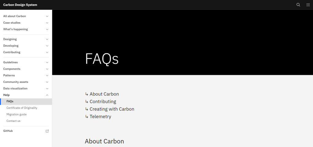
An exhaustive side-menu
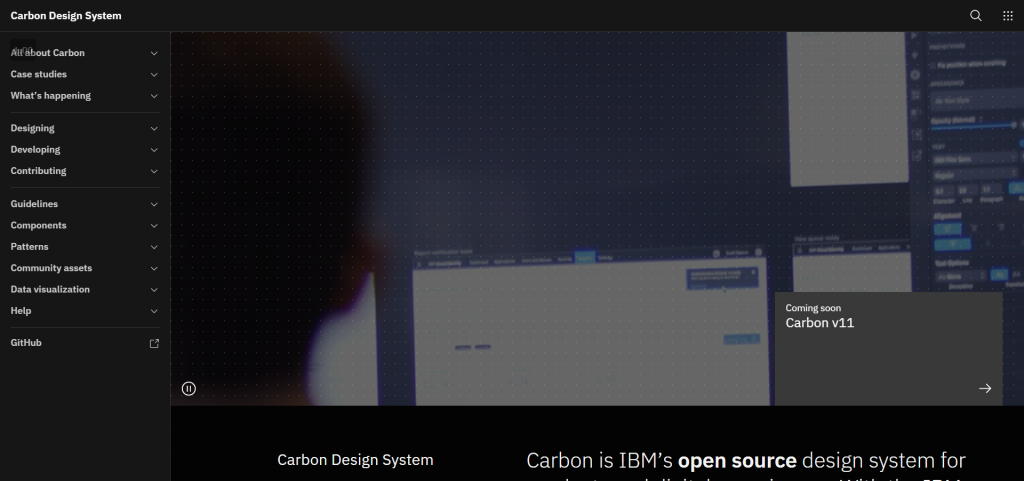
There’s a reason why many design systems opt for a sidebar menu that’s always visible: it gives a lot of room to put almost every page in it, with the ability to group and nest them. Carbon makes good use of that to display right away numerous topics it covers and help visitors get to what they’re looking for quickly!
If you can figure out a way to put a sidebar in your Design System, then it’s a great place to be exhaustive: group pages as needed but ideally, you should be able to put everything in there, in an order that makes sense, to encourage discoverability and efficient browsing of the documentation.
Atlassian’s top and side menu alternative
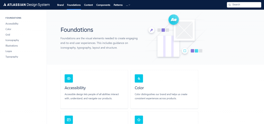
If your design system is very large or if your audiences have less overlap in their interests you can opt for a navigation pattern like Atlassian’s Design System: one main navigation with the key topics, and a side-navigation that changes based on the topic you’re currently browsing.
This makes for a smaller sidebar that is easier to scan, but unless you click on the “Content” link in the main navigation, you’ll never know what sub-sections it contains, making your content harder to discover.
Homepage as a hub
Most design systems have multiple audiences, most commonly UX and UI Designers, and Developers as users and contributors to the system. The homepage is designed with this in mind to ensure that the right people find the right content: “Get Started” guides for designers and developers are the main two things you’re presented with, followed by assets to get cracking and links to learn more about the design system and learn how to contribute to it.
Unlike the side nav, the homepage is definitely not the place for exhaustiveness: figure out who your most important audiences are, what they need when they get here, and figure out how to deliver it to them quickly for better adoption.
Giffgaff’s Design System sections
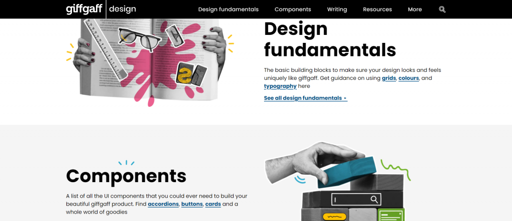
With a very unique visual style, Giffgaff’s homepage is a great example of putting the right content in front of your audience. Not only does it easily displays content for writers, designers, and developers, it even links to direct pages for faster access, whether it’s about grid and typography for their designers or the documentation of frequently used components for devs!
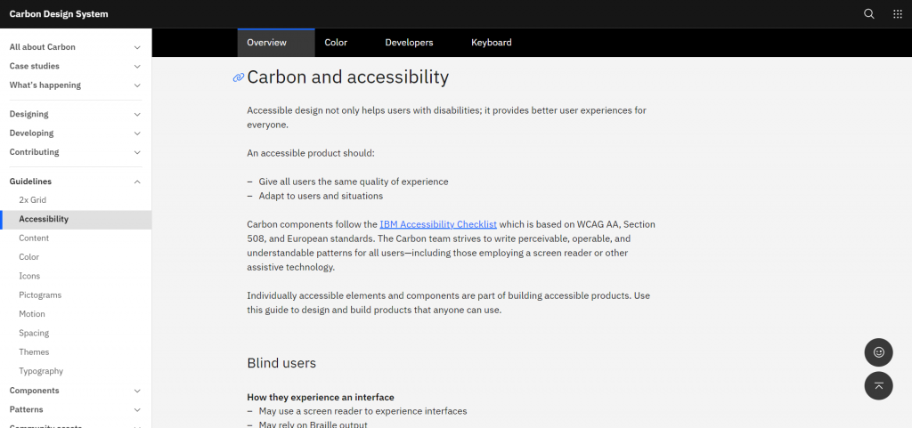
Table of Content
Every page starts with the list of headings it contains and you really can’t miss it because it’s pretty much the first thing you see. Again here the goal is simple: help you get to the information you’re looking for as quickly as possible. You can still read the whole page if that’s what you need but you know what you get yourself into and are less likely to be on the wrong page and not realize it.
While this is a common pattern Carbon goes in 100%, the table of content takes up a lot of space and isn’t hidden on the side as an alternative means of navigating.
Hudl’s Uniform sticky links
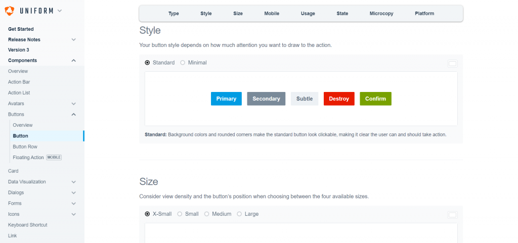
If you don’t want to commit to a full Table of Content at the top of your page Hudl’s Uniform approach is a nice alternative that helps jump from a section to another with the use of a sticky table of content displayed kind of like tabs. This is especially good for them because for each component they document a lot of things from design to development, but also copy-writing, when to use the components, examples and so on, so this helps accommodate users with the very long pages with maybe some content they’re not really interested in right now.
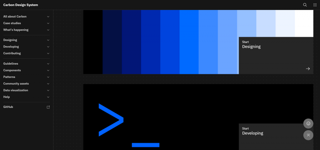
Previous and Next Buttons
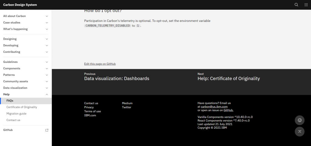
All pages start with a Table of Content and they all end with Previous and Next Buttons. You can never get stuck, you can never wonder what the next thing to learn is, at all times you’re nudged towards a next step while given a link to the information upon which what you just read was based.
If you’re starting from scratch, you can think of your main topics and pages in a linear manner, otherwise, this can be a tricky exercise, trying to figure out the best resource to follow the one that was just browsed and avoiding loops but it’s a great exercise to keep your audience in mind.
Mozilla’s Design System very large buttons
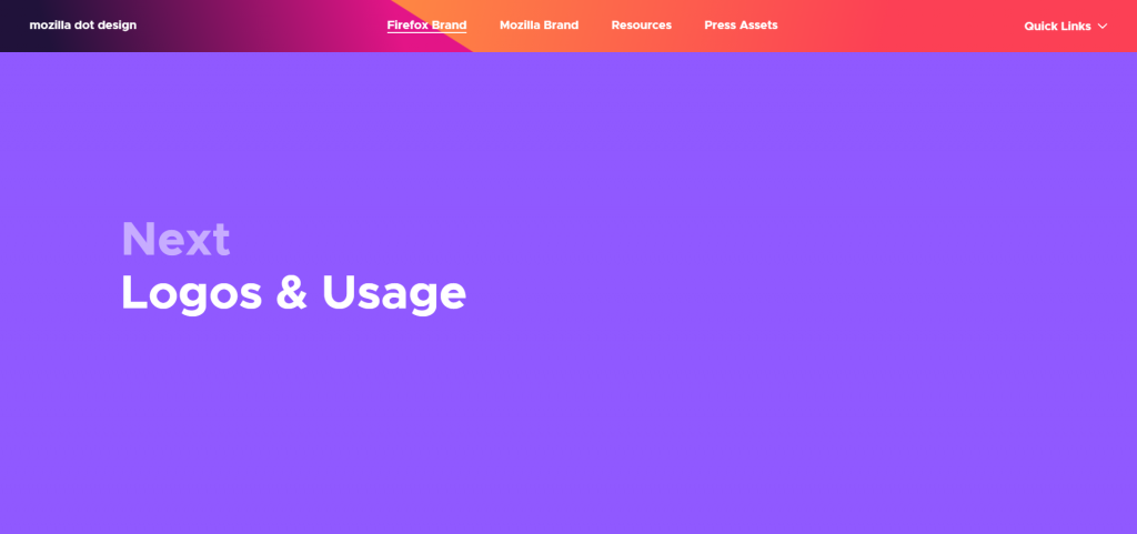
If you want to be sure your readers know where to go next, make the button take up all the viewport’s space… Or that’s apparently what the fine people at Mozilla Design thought… And it works pretty well, it’s bold but it works!
Linkable Headings
Very common in technical documentation, the ability to easily link to direct parts of a single page is a simple way to promote the design system as a single source of truth among the people of a company. While most developers might know how to create an anchor link looking at the code, adding the little icon makes sure even less tech-savvy users can share links to specific parts of a page.
Depending on how you’ve developed your design system this could go from very easy to develop to quite long but if you can get it done easily, it’s a nice touch, especially for longer pages like FAQs, Guideline pages, or Changelogs.
Autocomplete Search
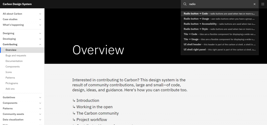
When looking for something a search input is either the best thing you could hope for, when done well, or completely useless if it doesn’t yield any results! The same is especially true in design systems where many components have multiple possible names, where you could use jargon specific to your company’s business, and so on.
Components Visual List
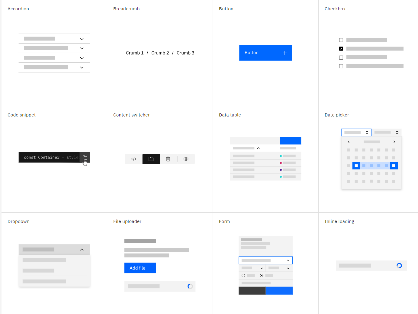
Almost all design systems include a pattern library with components but they’re often just listed as text. You can take this one step further and instead add a visual example of what the component actually looks like.
This serves two purposes: first of all, it increases the discoverability of your components, having one place where a basic example of all your components are displayed so that anyone in the company can quickly figure out whether what they need already exists or not. The second purpose is to reduce ambiguity: naming things is very hard and the only bulletproof way to present components is by showing what they look like.
Decathlon’s Vitamin Components Status Table
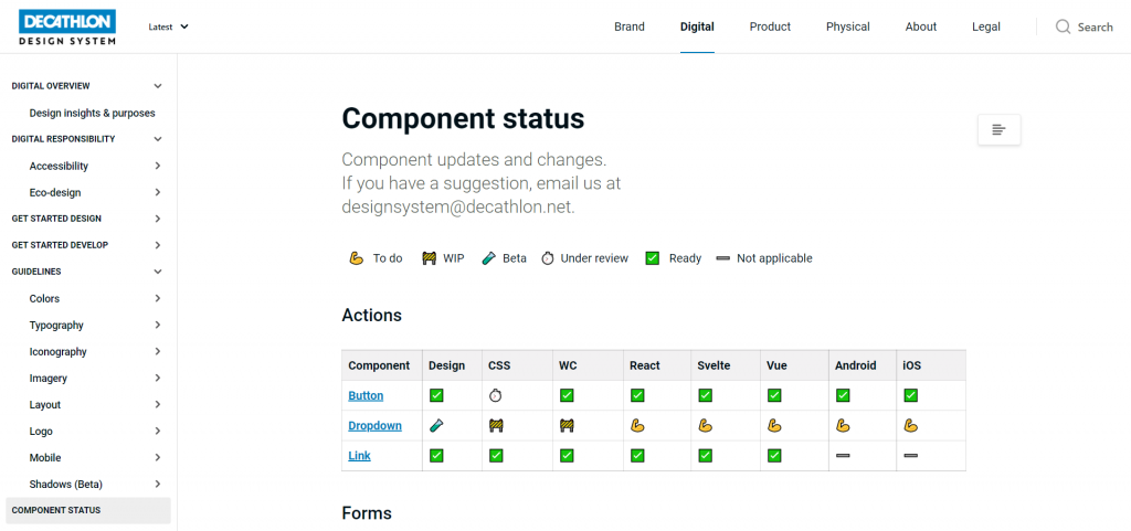
Vitamin provides components in a variety of languages and frameworks but obviously, not all of them are ready at the same time.
Decathlon opted for a Component’s status page that displays which components are to be done, in progress, or finished which is another interesting piece of information especially if you want to let users know of what you’re working on and what’s coming out soon.
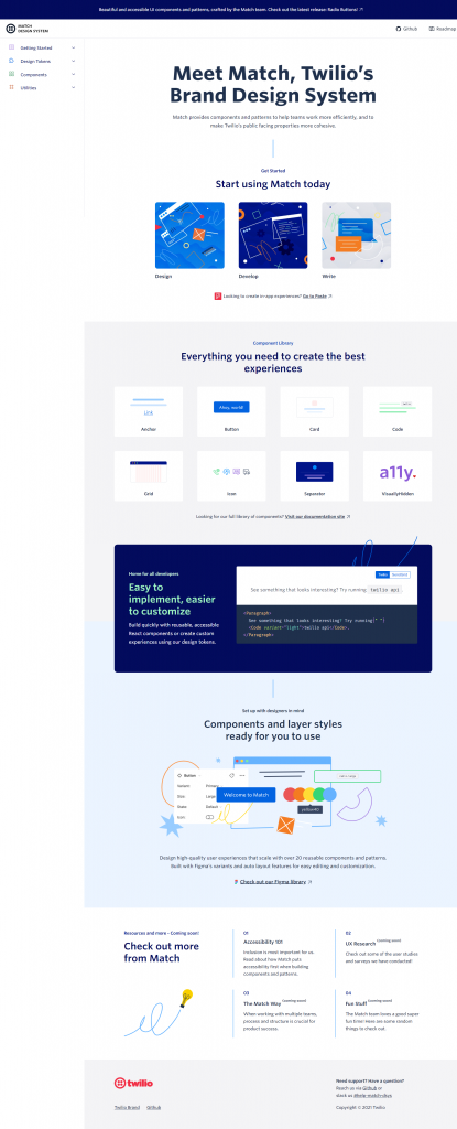
Twilio’s Design System’s homepage
Having looked at Carbon and all the great navigation patterns used in it, I recommend you take a look at Twilio’s Brand Design System Match. Here are the highlights :
- Direct links for different audiences
- Components Overview
- Exhaustive navigation
- Presentation of additional tools and resources
This is pretty much a master class when it comes to good navigation and I encourage you to steal this approach when crafting your design system’s main entry point!
With all these great patterns I hope you have some new ideas to improve the navigation of your design system. While on the topics you can also take a look at the showcase I’ve published a couple of days ago: Content Strategy showcase : 12 Design Systems that get it right for more information architecture goodness and great copywriting!
If you’ve worked on a design system with really cool navigation patterns or know of some that would be great additions to the list please send them my way and I’ll gladly add them here or in another article!