Almost anyone working with Design Systems knows about Atomic Design, but most often Atoms and Molecules get all the attention. Today we’ll look at the other hand of the spectrum: templates and pages, and how to present them best.
Here’s a list of ten examples to inspire you to improve your own design systems. They’re quite different and some of them are fairly easy to replicate, while a lot of thoughts went through others to create comprehensive documentation of these large compounds of principles and components.
Finastra’s Incredible use cases
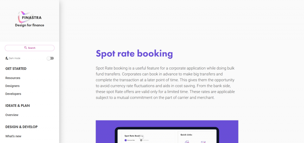
Finastra’s documentation features 5 use cases that guide the reader through the result, components, and designing process of some key features and pages. It’s a very effective way to deconstruct the pages, encourage discovery and usage of components and provide designing guidelines by showing how they’re used.
IBM’s Design Language Gallery
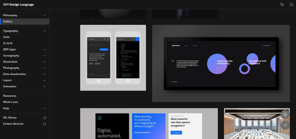
IBM’s brand expands beyond websites and app and its’ Design Language Gallery showcase the wide variety of supports and contexts it’s built for. From immersive apps to simple messaging systems, from promotional content to very task-focused interfaces, if you have as much variety in what you design it’s a very good idea to showcase great examples of on-brand design.
Maif’s Design System Templates
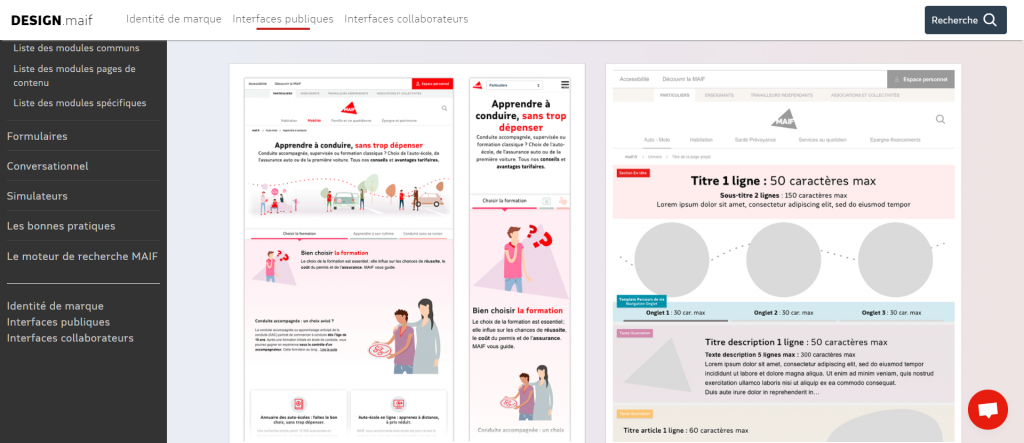
Maif’s documentation is among the most exhaustive I could find for full pages. Here’s a list of the good ideas to steal :
- Responsive screenshots with real copy and imagery
- Links to live examples
- Redline version with content guidelines
- Related content and design specifications
- Designing thought process
- Notes from past user-tests and the findings
- Technical documentation for CMS contribution
If you’re not sure where to start, you can’t go wrong trying to cover as much as they do!
Australian’s Government Design System
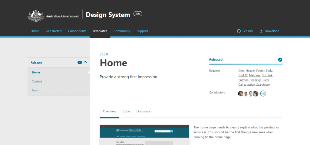
This example is a more basic one but a good starting point that any team can aim for: it features an example, access to code to get the same results, and guidelines to use it properly in projects. The ability to customize colors and to view the page as users with different types of color blindness is unique and quite nice too!
Cyclop’s Starter Pages
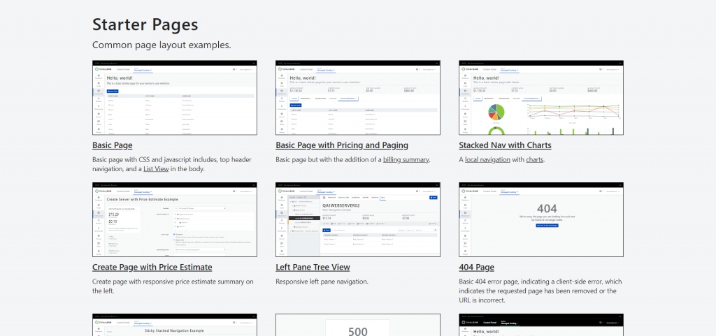
When it comes to making websites, layout is both easy and hard: there are many ways to get things done making consistency hard to achieve and poor choices can be hard to correct later on. For this purpose having a wide selection of pre-made layouts and templates to copy is a good idea, especially if many of your company’s frontend developers aren’t too fond of CSS.
CenturyLink’s Design System provides layouts that cover all needs so that teams and developers can then focus on filling them with the right components to get the result they’re looking for.
Duet’s live page docs
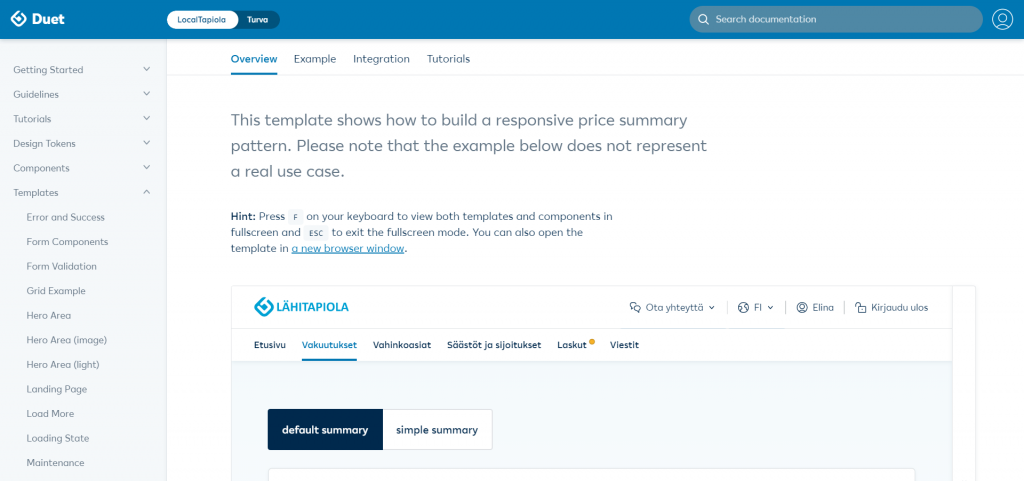
LocalTapiola’s Design System is one of the very few I’ve found that features interactive examples, along with design and development guidelines. It’s not surprising that so few manage to get it right: pages are difficult to properly display inside the documentation pages.
Duet’s templates pages are hubs that start off with the example, the code to make it, and links to relevant guidelines and tutorials to make good use of it. This is an effective way to document templates and provide useful information at the right time.
Mozilla’s Design System
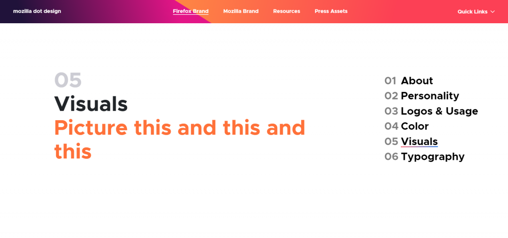
Similar to IBM’s Mozilla’s Design System features a wide variety of supports and contexts. It also starts with more abstract imagery with logo and illustration variations.
If your Design System only showcases atoms and molecules, this is a very easy first step towards showing templates and pages: a bunch of screenshots of diverse pages!
Pega Cosmos Page Layout
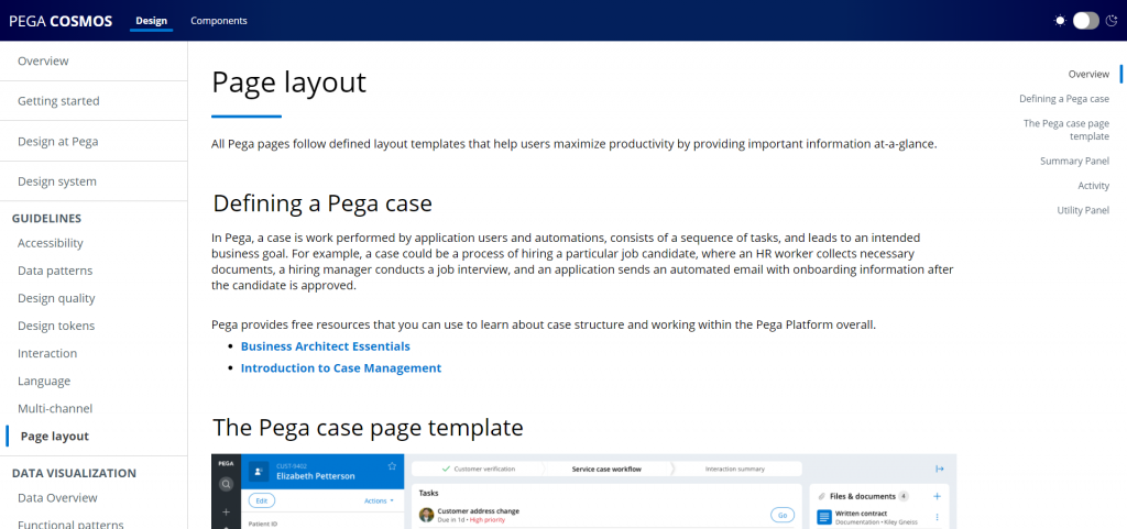
One of the benefits of a Design System is to foster a shared language to make communication amongst teams and roles easier. Cosmos’ Design System does that at a layout level by explaining how a full page is built with the names of its parts.
Polaris Page Structure
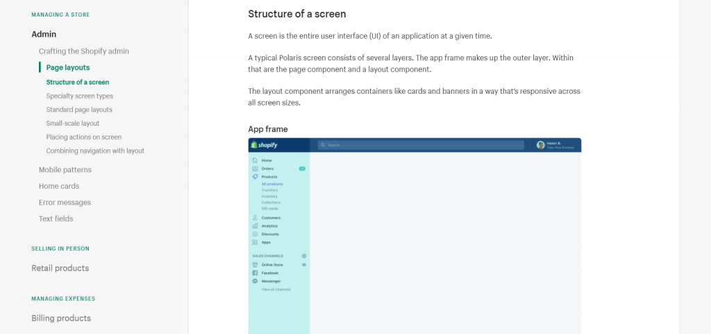
Deconstructing a standard page, explaining why it’s built the way it is helps future designs be consistent and teams create a coherent experience. In Polaris, this is done with numerous examples taken from all kinds of screens and for all viewports to provide the best guidance possible. It also helps showcase how components should be used and how their relationships and layouts should be designed.
Axa’s Design System
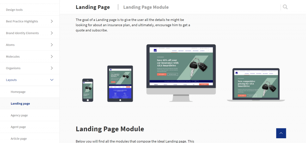
Axa’s Design System’s navigation is built around Atomic Design and it features a Layout’s page with nice examples. The Landing Page is a nice example to steal from, containing everything from design specs to development-related documentation and assets. The documentation also lists the components that make sense on the page along with a brief explanation of how best to use them.
This is the end of our round-up of these great examples of templates and pages, according to Atomic Design, in Design Systems. I hope this gives you ideas to document and showcase full pages in your own Design Systems, from the easy visual galleries to the fully documented specs.
It’s great to note that as we’ve already seen in our Content Strategy Showcase, most good examples use real-world content and link to live pages too, to guide readers towards consistent layout, proper component use, and also proper content formatting.